Erin Platfoot
Home Portfolio Resume

Smart Logbook

Pilot logbook app for iOS and Android.

Client

Kviation, Inc.
Alpharetta, Georgia

Goal

Update the app's design to adopt the modern Android design system, Material Design, and also resolve usability issues that existed in the previous design.

My Contribution

I worked with the developer to understand the functionality of the screens and the needs of the pilots. I designed and mocked up new screens using Adobe XD.

Flight Editor Redesign

The Flight Editor is where the pilots log information about their flights.
This is the most important and frequently used screen in the app.

Problem

Pilots were not filling out all of the fields, and some pilots were requesting new functionality that already existed in this screen. The previous version's design looked cluttered, the Holo style buttons and icons made the screen look busy, and there wasn't a clear path for entering in the information.

Before

After

Resolution

I updated the app bar to be consistent throughout the entire app. I created distinct sections with a consistent layout to make it easier for the user to navigate the screen. I added icons to represent the information in each section.

Detailed updates and descriptions are shown in the annotated screens below.

New Flight Editor

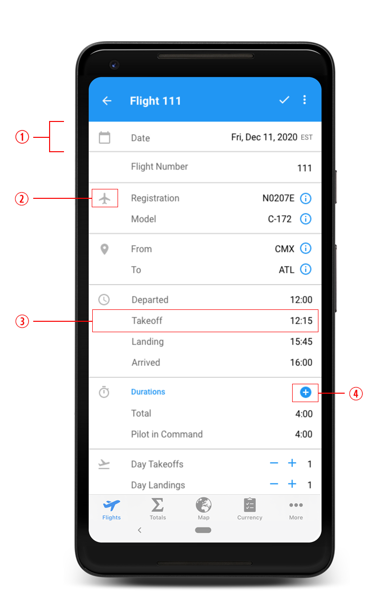
The Google Calendar App provided inspiration for the appearance of this screen. The app has clickable text and is divided into sections with lines. There are left-aligned icons for the user to be able to quickly identify each section.

  1. I grouped the information into sections, separated by lines. Most sections have an icon on the far left, followed by clickable text buttons, and then the information the user inputs is right-aligned.
  2. Most sections have an icon to represent the type of information being displayed. This makes it easier for the pilot to quickly scan the screen.
  3. The gray, clickable text is a button that is left-aligned and allows the user to input content with a dialog, brings them to a secondary screen to make a selection, or allows them to edit the field in place. After the information is entered or selected, it appears on the right side of the screen in black. In the previous version, the information was mostly left-aligned but it had multiple actions in each row. The buttons, icons, and actions made it difficult to quickly scan and process the screen.
  4. There is a bright blue Add button that allows the pilot to add additional fields to this section. Even though the previous version had an + Add duration button, it blended in with the rest of the screen. Pilots occasionally couldn’t find the button or didn’t realize it was clickable.

Aircraft List Redesign

The Aircraft List is where pilots can see all of the aircraft they've flown.

Problem

The app didn't have a consistent app bar. The back button was too small and didn't provide a big enough surface area for tapping. The screen was not labeled. The main functionality, adding new aircraft, blended in with the rest of the text.

Before

After

Resolution

I updated the app bar to be consistent throughout the app and adhere to the current design system. The updated version has a more usable back button. The most prominent action appears as a floating action button, making the action easier to identify and the placement more ideal for tapping. Pilots can see a picture of their aircraft with each aircraft list.

Detailed updates and descriptions are shown in the annotated screens below.

New Aircraft List

  1. I modified the app bar, replacing outdated icons with standard action and navigation icons.
  2. I included an option for pilots to see photos of their aircraft in the list. Having an image makes it easier to quickly identify the aircraft in the list. It also looks more visually appealing.
  3. The Material Design website has very specific specification guidelines for the lists. I created the two lines list with a large rectangular image. These are the requirements I had to follow:
    • The image size is 100x56 dp.
    • The spacing adheres to the specifications identified in the website.
    • I used the recommended font, size, and color for the text (aircraft registration and type).
  4. The most common action on this screen is adding a new aircraft. I removed the add icon from the top of the menu and made it a floating action button (FAB). Now, the icon is more visible and easier for the user to reach.
  5. I added the screen’s title Aircraft to the app bar to be consistent with other screens.
  6. I replaced the back button with the Material Design back button. It is bigger and has a larger surface area for tapping. The previous version’s button was too small and the placement was too close to the edge of the screen. This made it difficult for the user to accurately tap.
  1. The user has the ability to sort their flights by registration (alphabetically) or date last flown. The sort button is available in the ⋮ overflow menu. Displaying this information was challenging because there are only two options to select. I wanted the user to see which option they had selected and only be able to change the selection to the other option. I first considered using a menu with radio buttons so the user would know which option was selected. However, this method was no longer supported in Material Design. I made a mockup of a drop down menu, disabling the option that was already selected and I grayed it out. That menu didn’t flow well, and I believe it would be confusing to the users. I decided instead to create a bottom sheet. This option made it possible to indicate which selection was enabled by showing a checkmark next to the text.